The Challenge
Develop a brand identity for Pedraza, a transport & logistics company through the creation of a Logo, Stationery assets, truck look & feel, and relevant merchandising to enter market in a strong and reliable way.
Outcome
A well polished identity that evokes a trustable and fast service. The use of 2 colors, negative spaces, and easy to read element, makes it an effective and versatile brand with a logo that can be replicated for multiple purposes.
The Process
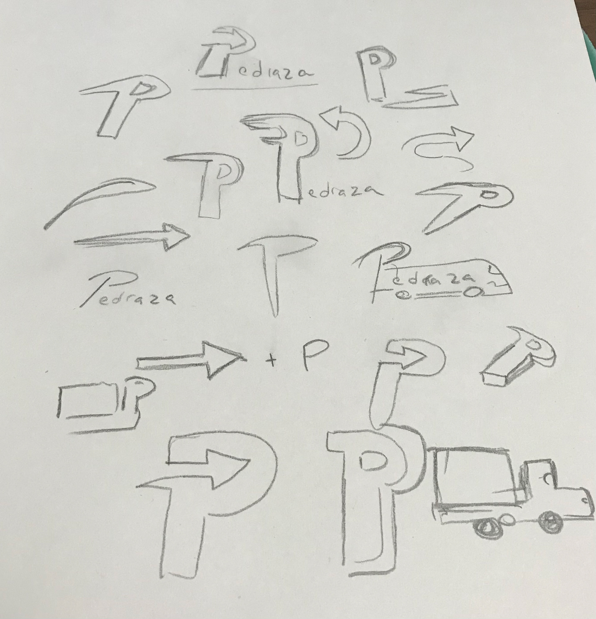
Sketching is always my first step when starting new projects. In this case, since the company is a family business, the client requested to use the first letter of their last name as the main element. Since the beginning of the project, it was clear the we wanted to transmit "fast" and "reliability" as the main concepts for the brand, that's how we ended up mixing those elements with the letter "P" from "Pedraza".

Going Digital
Once I felt comfortable with the development of the concepts in my sketches, I proceed to go digital. I just loved creating a negative space in the form of an arrow, and adding those straight lines to give movement to the "P" symbol. Small details like shifting the symbol to the right to emphasize even more in the movement, were things I consider to make it even more easy to understand.


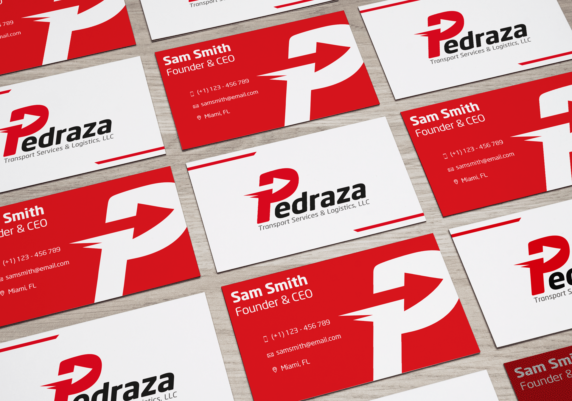
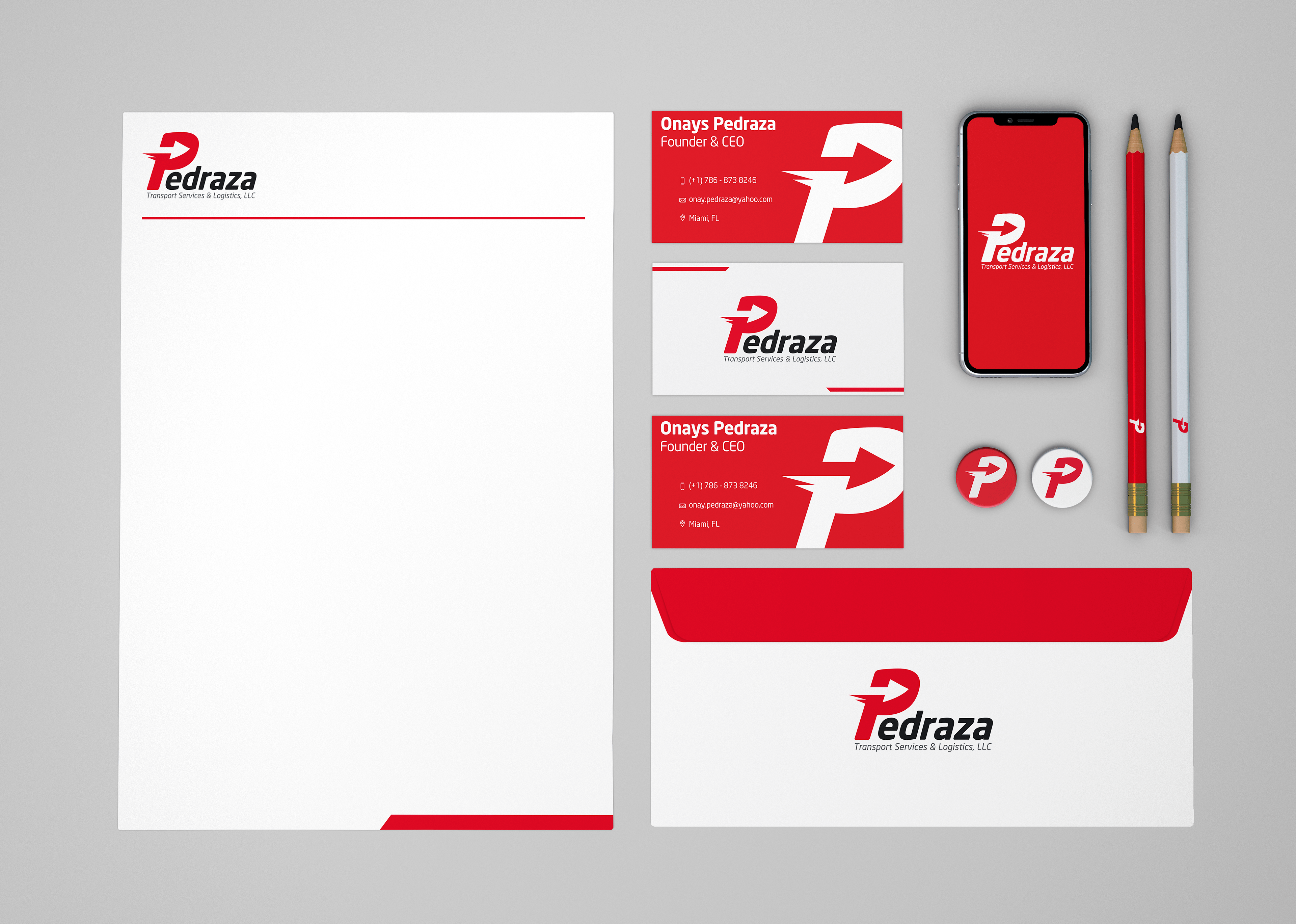
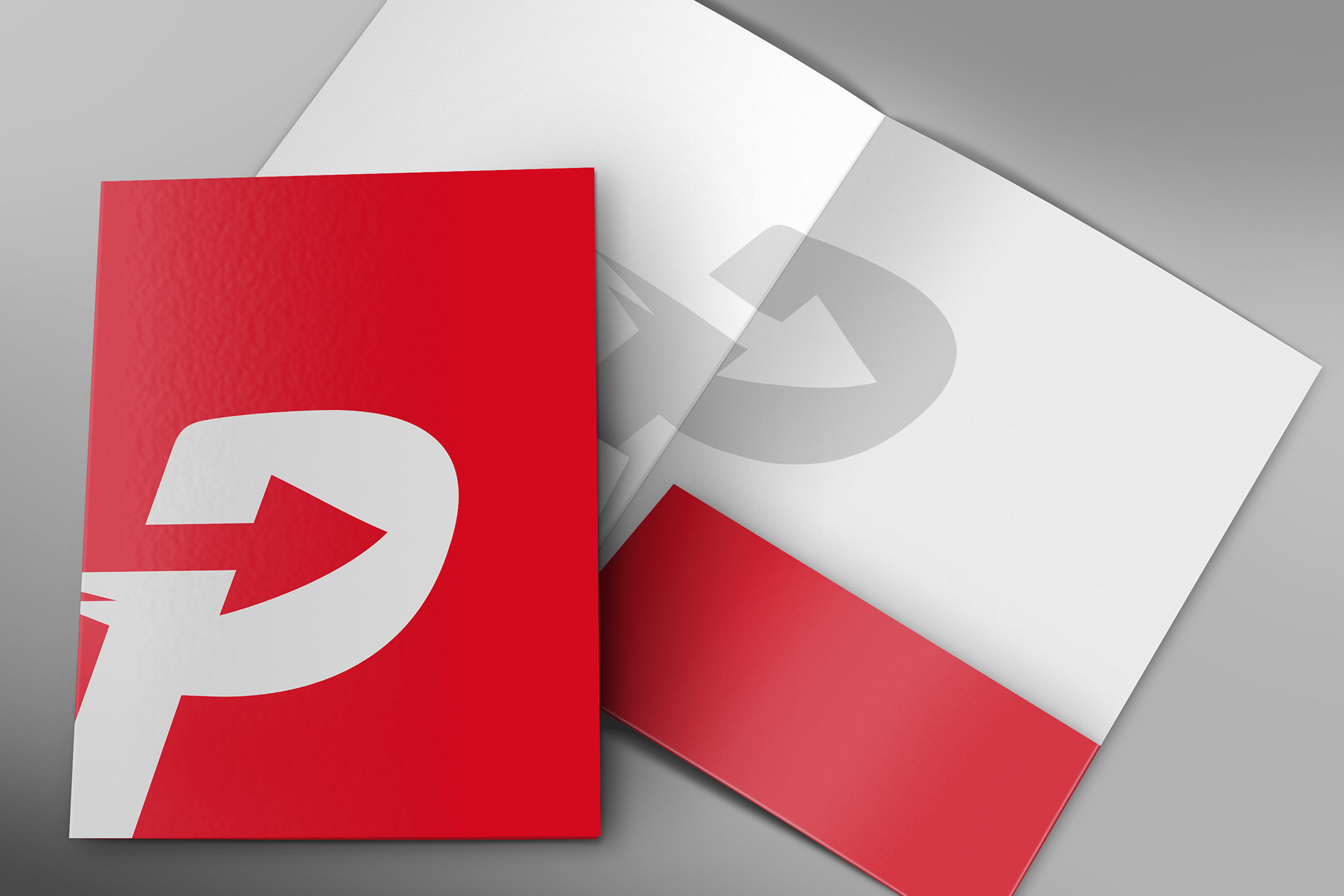
Stationery
Business cards, letterhead, envelopes, and folders, were designed in order to strengthen the brand. I decided to use red and white colors to create high contrasts.
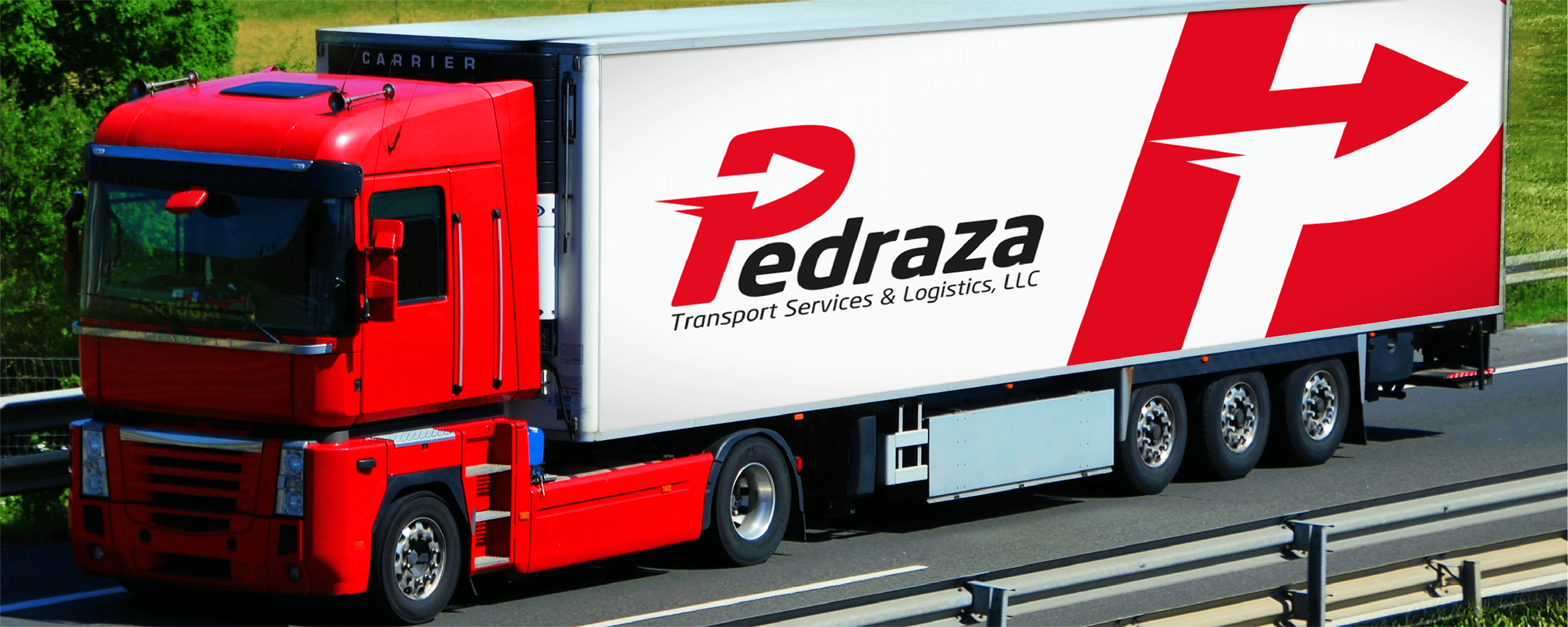
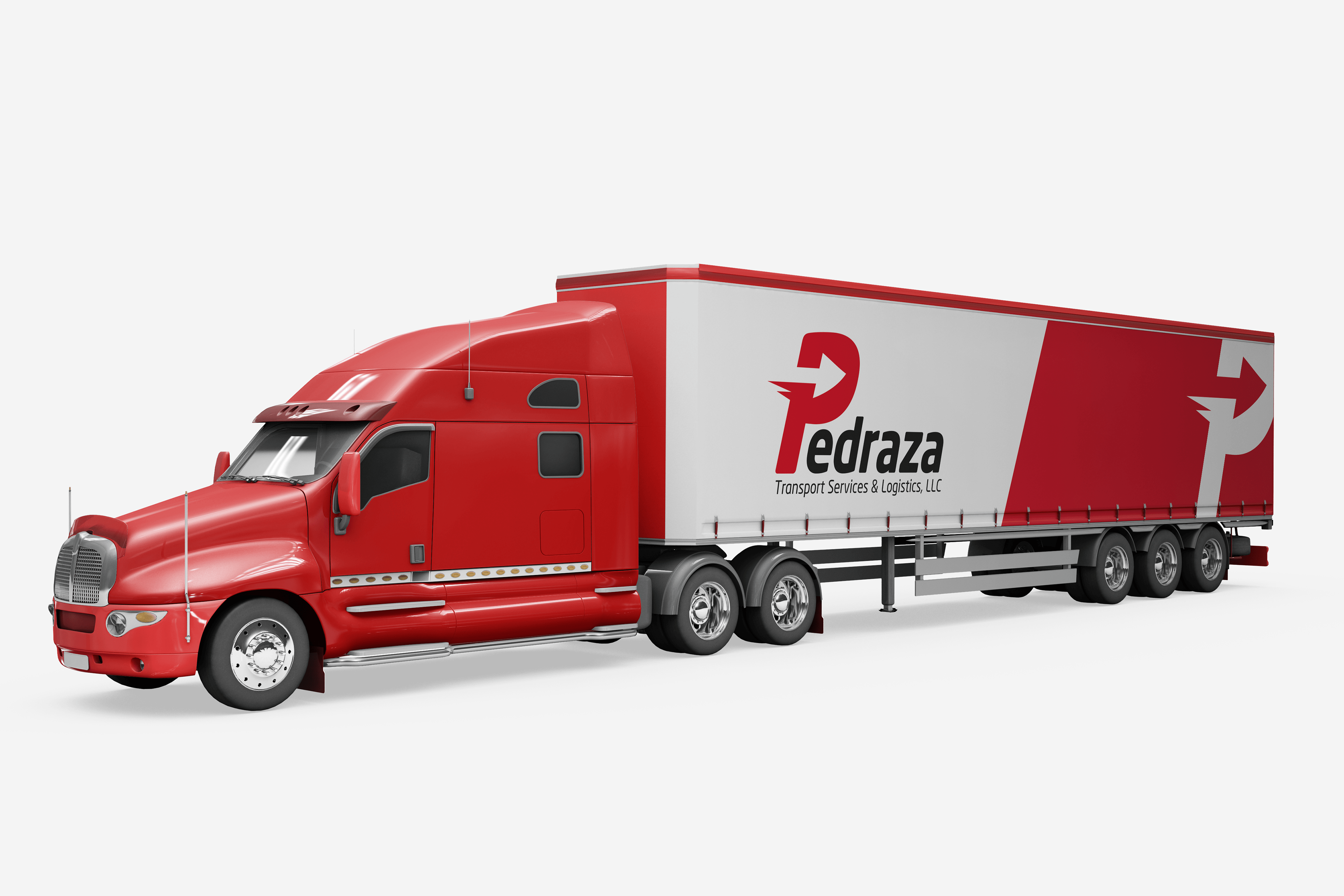
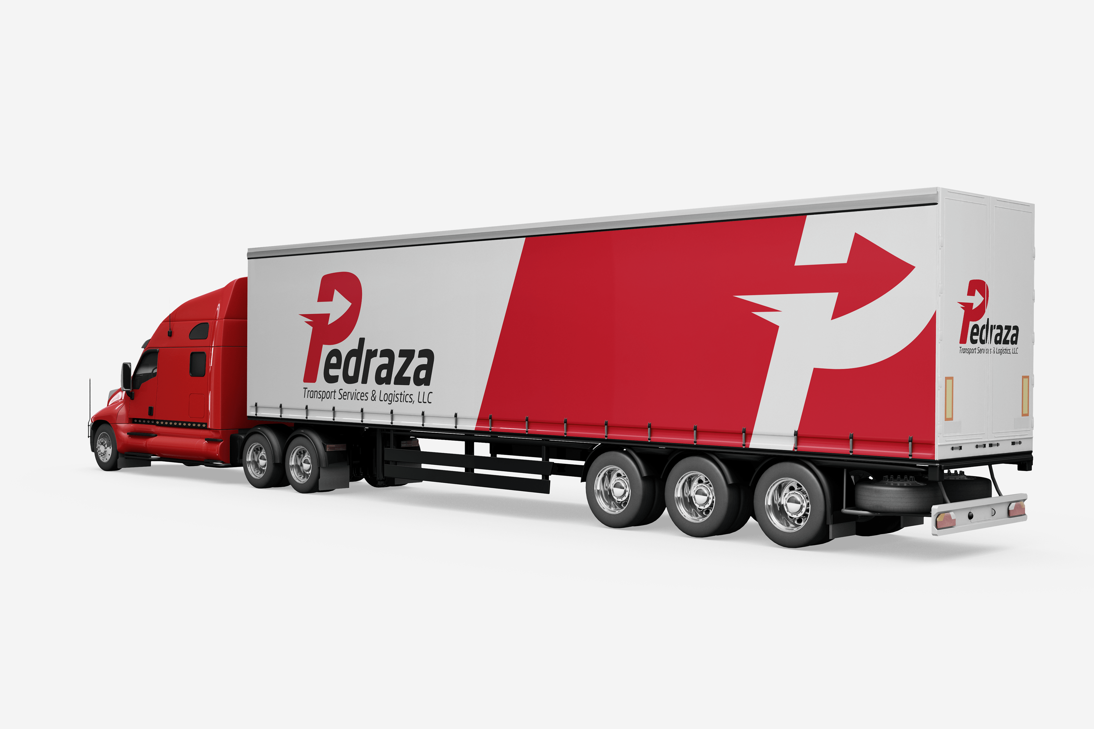
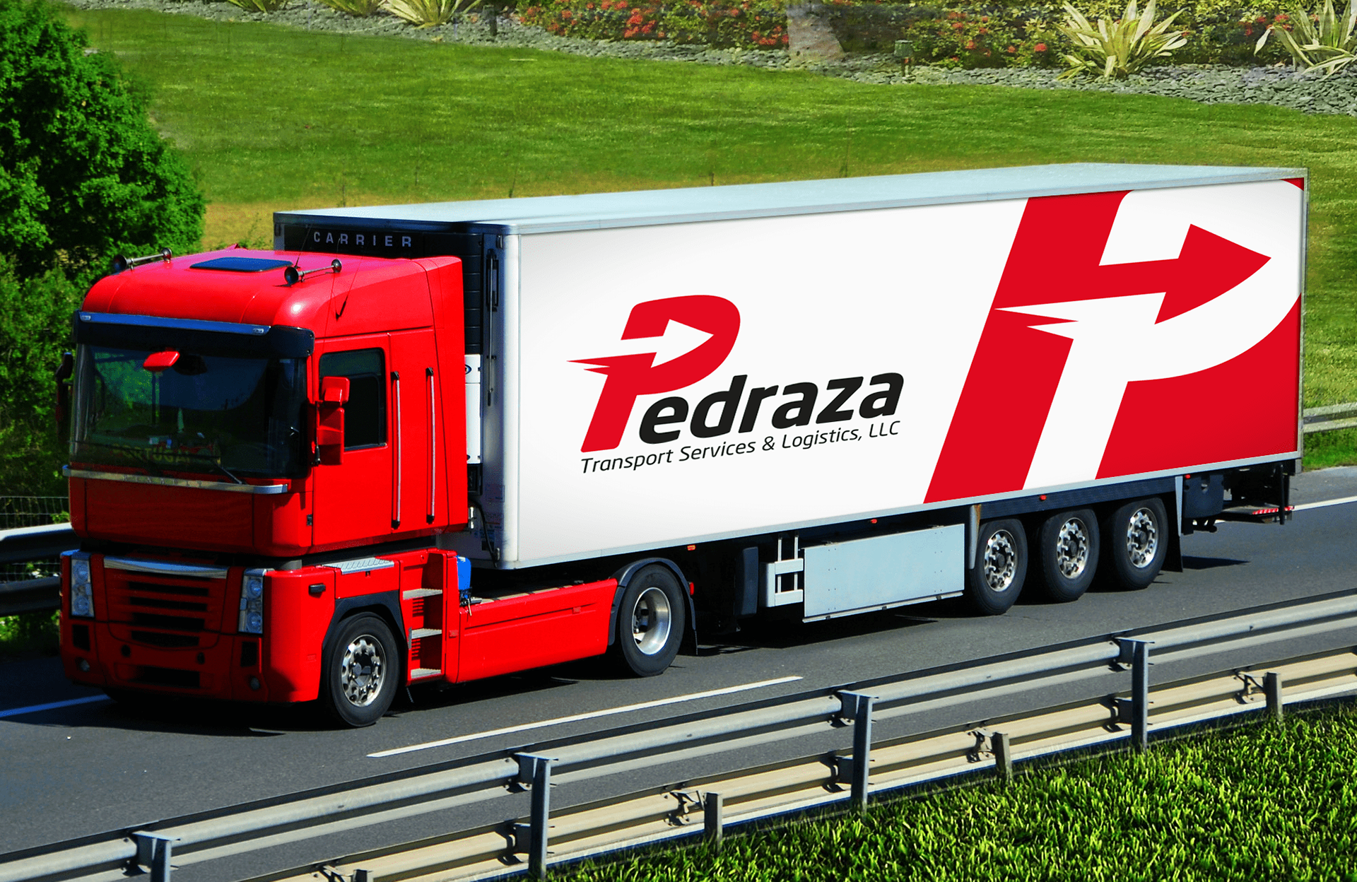
The Trucks
Some examples of how the trucks should look like. The idea was to use 80% red, 20% white to make it stand out, and maintain the guidelines established in the logo and stationery elements.
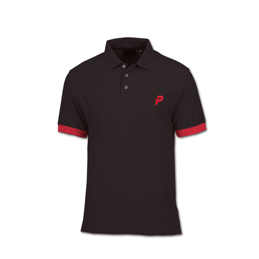
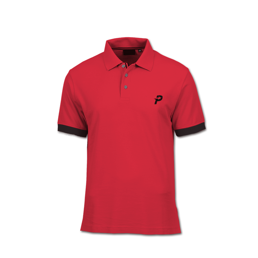
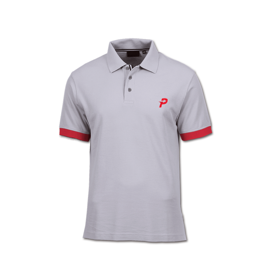
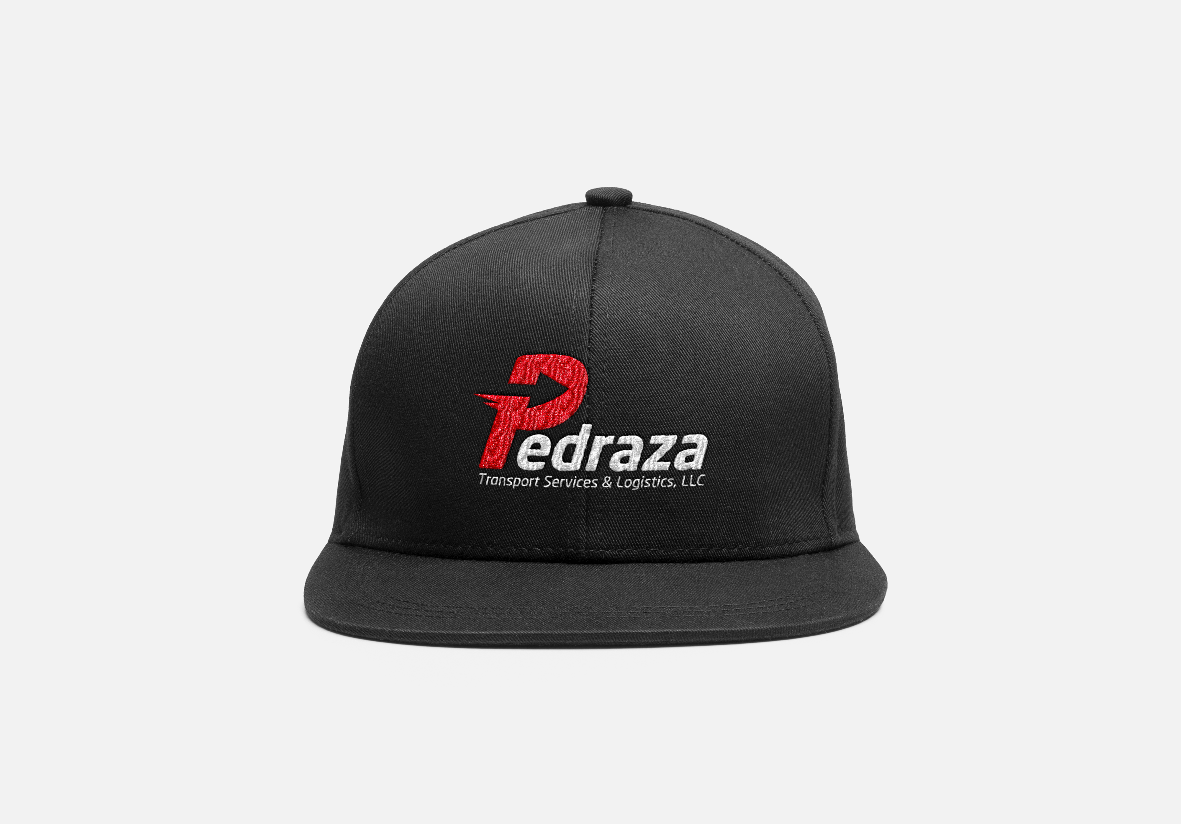
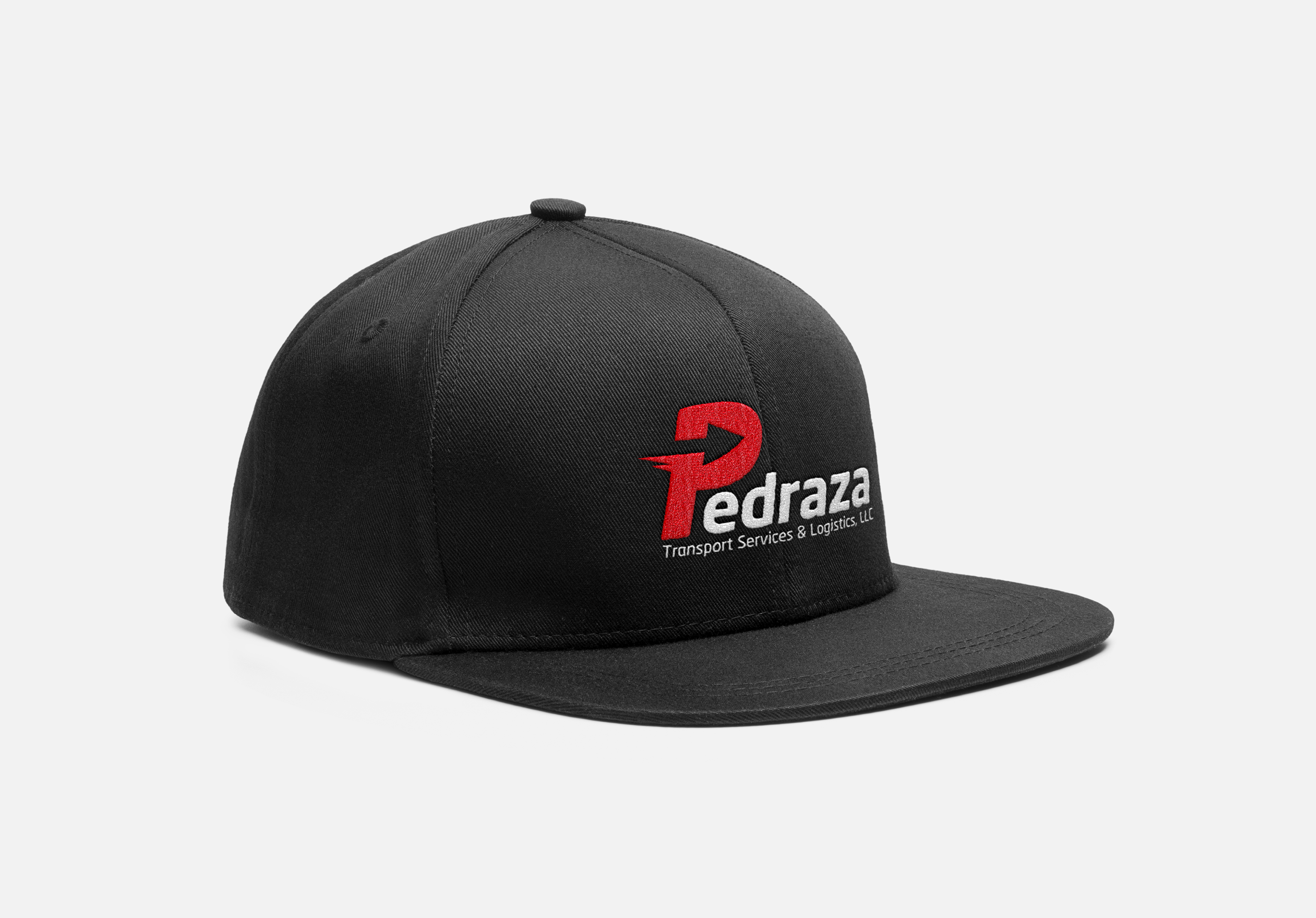
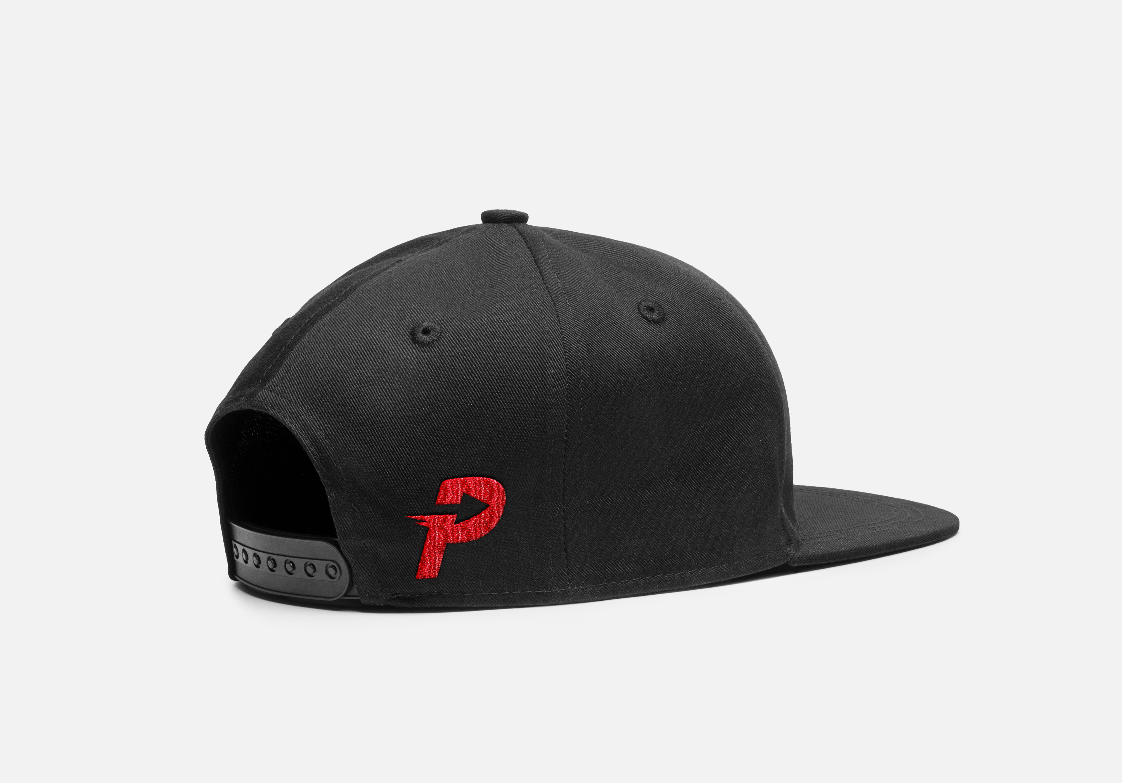
Merchandise
Implementing uniforms will always offer a level of formality and reliability to an institution. Imagine a driver that arrives to its destination and shows himself with one of these nice looking polo shirt, along with a cap. It will reflect seriousness and respect for the company.